Here’s what’s new after Döner Shack’s rebranding
For one thing, it will include a new colour palette and a new logo.
Döner Shack plans to target younger customers by redesigning its restaurants and incorporating a new logo.
According to the brand, the move is aimed at appealing to a younger demographic and positioning the brand to have more of a mainstream feel with a focus on the flavour of the food.
“When we conceptualised our brand, we had one simple mission in mind – to become the number one kebab brand in the world. After five years of experimenting, researching and, most importantly, innovating, I think we have nailed it! Our fundamental principle has been, and always will be, to serve up incredible tasting food; so with this brand repositioning, we aim to enhance and solidify our position within the QSR sector,” Sanjeev Sanghera, Co-Founder and Managing Director of Doner Shack said.
What’s changing
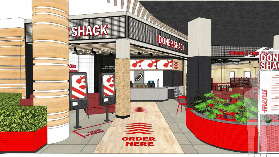
With the help of interior design service, Studio Jim, Döner Shack’s new look will incorporate red, black, and white as its primary colours. It will also sport a new logo featuring a solid white colour with red outlines
The design of the interiors took inspiration from streetwear and pop-up retail stores to create a vibrant and dynamic atmosphere for their new target audience.
There will also be a polaroid wall to display the memories of the team’s many previous trips to Berlin and affirm the authenticity of the brand.
Additionally, the new restaurants will start to offer Döner Shack merchandise in-store, from baseball hats to t-shirts and hoodies, to enhance the customer experience and create another touchpoint that is fun and engaging.
To enhance the dining experience, the new restaurants will also incorporate digital screens and self-ordering kiosks. Döner Shack will also offer a rebranded and revised menu which will introduce a wider produce set that offers morning, lunch, and evening options, including new loaded fries, waffles and sliders.
Doner Shack’s Brand Director, Nathan Holloway, has been responsible for directing the new brand positioning, having worked closely with the brand’s board of directors for over eight years. “We’ve created a new visual identity for the brand to allow for simplicity in colour and shape. The new Doner Shack will be instantly recognisable, and with the branding more simplistic with a pattern that runs throughout, it will appeal to the Gen Z target market. Speed, efficiency and convenience are paramount to this audience, so we have made sure this is at the core of our brand revamp… not forgetting a touch of fun for our customers!”
There are also plans to collaborate with sports, gaming and local artist personalities to create brand-specific merchandise, all of which will be readily available to purchase.
The rebranding will take place across the five stores operating across the UK, beginning with Glasgow in early September. Leeds, Manchester, London and Leicester will follow shortly behind with all sites completed by the end of the year.
There are also plans to collaborate with sports, gaming and local artist personalities to create brand-specific merchandise, all of which will be readily available to purchase.
“Our customers are at the forefront of everything Doner Shack does and this strategy has already yielded great results – we increased our year-on-year sales by 37% in our Manchester store in June and July and 11% in Leeds. We have also decreased our cost of sales following some tough negotiations with suppliers, including a 25% reduction in the cost of our supply chain, so our customers don’t have to bear this cost themselves,” Sanghera said.
Doner Shack has plans to open a further seven new sites over the next year and up to four delivery kitchens in each of its existing locations to further expand its customer reach.
