Papa Johns unveil new interior design for international restaurants
The design incorporated the colour aspects of the pizza brand’s premium ingredients.
Papa John’s is getting a makeover for its international restaurants, targeting more franchisers to pick up the brand.
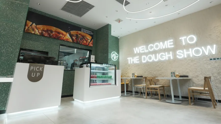
The new store design features colours inspired by Papa Johns premium ingredients like red for the Tangy Tomato, Green for Fresh Basil, off-white for the fluffy dough and light purple for the Punchy Garlic.
On the walls, customers will find artwork depicting Papa Johns new “hand-drawn happiness” illustration style that reflects both the vibrancy of the Papa Johns brand as well as the hand-crafted nature of its products. Digital screens and ordering kiosks will help customers choose and customize their order in a sleek, modern and seamless experience.
To bring this new restaurant design to life, Papa Johns has begun implementing a phased approach that will gradually roll out this new experience to customers and team members as Papa Johns continue being “Hungry for Better.”
The first restaurant constructed in the new design has opened in China’s Hubei province, and another seven locations are currently under construction or renovation across Jordan, United Arab Emirates, Saudi Arabia and Kenya.
“By reinforcing our premium position within the QSR pizza industry, this new restaurant design gives current and potential franchise partners another reason to say yes to developing with Papa Johns,” Amanda Clark, Papa John’s Chief International and Development Officer said.
