Check out Nando’s all new South African-inspired visual identity
Filled with vibrant colours, incredible patterns and interesting mixes of old and new, this new design is the first change to the brand in ten years.
The chicken chain announced the global rollout of its new visual identity, with inspiration taken from its roots in the people, places and trends of South Africa. The update features heavy influences from ‘new African design’ as well as its own food and people, paying homage to Nando’s heritage throughout.
The South African based design agency, Sunshine Gun, in collaboration with Nando’s restaurant staff, spent nearly two years making the new look. The lengthy process included the input of local South African artists and designers. New introductions include a Pantone colour ‘PERi Red’, a unique new ‘Nando’s Hand’ typeface, bespoke artwork throughout as well as an 87 degree angle tilt in its headlines, a nod to its first restaurant opening in 1987.
A spokesperson for Nando's told QSR that the decision to refresh the brand's image was to shine a light on new African design, for cohesion around the world. Nando's aims to stay ahead of the curve in the industry with a design that looks to the brand's cultural heritage.
Andrew Rayner, Marketing Director for Nando’s UK said: “It was a natural choice that our visual identity should be rooted in our South African heritage. It not only tells the story of who we are and where we’ve come from, but importantly, it puts our people at its heart.”
THE NEW “NANDO’S HAND” FONT & DIN NEXT
Inspired by the tradition of handwritten signage popular in Southern Africa, Nando’s worked with a classically trained sign-writer and artist Marks Salimu. Marks hand-painted all Nando’s letters and characters first onto wooden panels, with these then digitally created into a font, the “Nando’s Hand” font. The next update sees the use of the typeface DIN Next, the very same font used on road signs in Johannesburg, where the first restaurant was opened.
INTRODUCING NANDO’S PERi RED COLOUR PALETTE
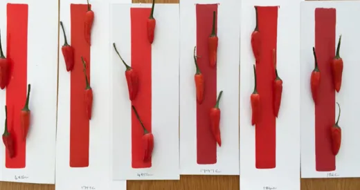
The new colour palette now features a specially created Nando’s PERi Red pantone, which was produced to match the exact tonal reds of the African Bird’s Eye chilli grown in Mozambique, used in the famous PERi-PERi.
"The Pantone colour already existed; it was about defining the PERi red with the help of Manie Peterson who visited the fields in Mozambique to locate the exact shade needed," the spokesperson said.
The colour was developed in a colour lab in South Africa, with colour specialist Manie Pietersen helping the brand determine the exact colour of PERi-PERi. The extensive research included visiting the fields in Mozambique and picking the chilies, to colour swatching the various shades, which resulted in the Pantone 1797 or PERi Red.
The palette also features black, a key colour used in new African design across the continent, while secondary colours such as bright neons bring an edgy, streetwise look into the mix. Comfort neutrals creating vibrant contrasts – all of which bring a celebration of life and energy that come directly from Nando’s restaurants, its South African head office - ‘Central Kitchen’ - and the country of its birth.
BARCELOS COCKEREL UPDATE
The Barcelos was given an update by using smoother lines and given a bigger heart, resulting in a more refined look. Placed alongside him is the new Nando’s logo with an added ‘PERi-apostrophe’, inspired by the shape of the African Bird’s Eye Chilli, the chilli used in Nando’s famous PERi-PERi – providing an overall cleaner, simpler and youthful look.
NANDO’S PATTERNS
Taking inspiration from the diverse and colourful new African design and art scene, three pieces of art have been designed for Nando’s to be used throughout its branding. Previous pictograms and illustrations have been replaced by South African inspired, oversized graphics, combined with key elements of the Nando’s brand. Featuring in the designs are triangles, which represents the family in Southern Africa, the African Bird’s Eye Chillies, the Nando’s heart as well as flames, to represent Nando’s flame-grilled cooking process.
"The new visual identity officially launches on 26th January. The changes will be rolled out over the following months, starting immediately with digital," the Nando's spokesperson added.
